By Celeste Hawkins
What better way to introduce the art of paper quilling and cutting than Melbourne based Graphic Designer Thalia Giann.
Passionate about all things paper-here she gives us a history as well as a deep explanation into her various works.
Thalia Giann’s exhibition “PaperCut” runs until August 21 at No Vacancy Gallery Federation Square. All works are for sale.
For enquiries or to say hello to Thalia email her at: tahlia.giann@gmail.com
ART DIARY 7- THALIA GIANN
Paper Qulilling (also known as Paper Rolling, Paper Scrolling, Filigree, Mosaic, and Quilling) has a long history for a relatively undiscovered art form with some documentation of it being practised as far back as Ancient Egypt. However, it is most noted to have been practised in the 16th and 17th century by French and Italian nuns as an inexpensive hobby and form of ornamentation on religious pictures.
Nowadays, Quilling is practised as more of a hobby in additions to card making and scrap-booking. There are many small communities based in America and Europe that have been united by the internet communicate and share ideas over social groups.
I first came across quilling at the age of 12 when I was on a P&O cruise with my parents. Under the ship newsletter, ‘Paper Quilling’ was listed as craft and I was intrigued to learn something new. After the first class, I made sure to attend every single class from there on. Once I got home, the hobby continued, it soon became a small business of creating and selling cards for family friends however it was on and off during my highs school years. It wasn’t until my final year of high school that I was faced with the prospect of creating art works. Having tried out a few mediums such as;acrylics, watercolours and inks; I decided to go back to quilling as it was the one I was most comfortable with. It was in year 12, I finally got the idea to take it into a Fine Art context and challenged myself to be inspired and create truly unique works.
I am now in the process of finishing my Graphic Design Degree and learning to not only create Fine works of art with Quilling but also create commercial work. The concept for PaperCut was something I have always been intrigued with since introduced by a lecturer in my first year. For me, Pattern is fascinating well beyond the aesthetic visual interpretation. Pattern is about being able to see things differently, notice every day quirks which eventually add up into insights (commonly known as the Actor Network Theory). Every since learning about this way of thinking, I have always tried to apply the practise into all my works including my part time job, internships and uni assignments.
It was not until my third year of uni, one of my lecturers encouraged me to delve deeper into my love for Paper Art and Pattern and develop ‘PAPERCUT”. It started out as a theortetical idea, however after the completion of one piece of art work (Pastel Dome), it served as a catalyst to continue. I then began looking for a gallery interested in PaperCut. Early January, I received email confirmation from ‘No Vacancy’ that they had a space in August and from there, months of hard work began.
PaperCut has easily been the most rewarding experience for me. I am so happy with the work produced and if this has confirmed anything for me, it is that I feel most happy and invigorated when I am working to create art and see how it profoundly impacts on my audience.
However art is only the starting point for me and I am very interested to see how I can take this further into complex problem solving and graphic design…
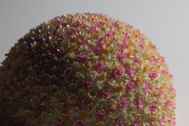
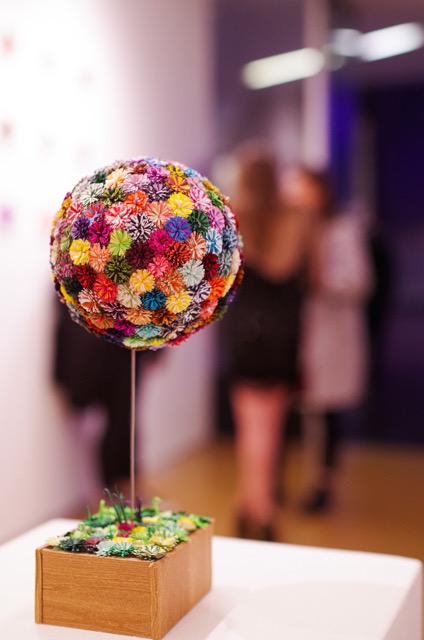
Pastel Dome
Pastel Dome was the first piece I created and was easily one of the most time consuming pieces. It consists of a small dome with a diameter of 95mm covered in sculpted flowers. Each flower first begins as a silhouette from a punch (8mm diameter) before it is then layered and sculpted into a flower. Then these flowers are glued onto a polystyrene dome. Pastel Dome is about the ambience of nature with the soft colour’s clustering together. It is about an experience of being able to see it from far away and then see more detail and new things as the closer you look at it. I like to think of the Pastel dome as a beehive as all the flowers are merging to centre.
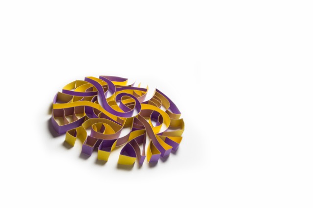
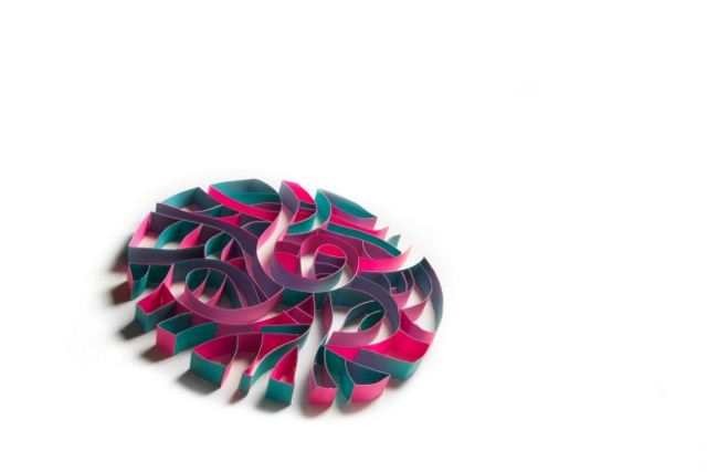
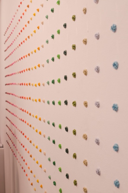
Fireworks
Fireworks was an interesting piece, as the idea came to me all of sudden during May. Fireworks is more then just pattern evenly spaced and arranged, it was about emotions. At this point of my life, I had felt an overwhelming sense of comfort and happiness with my friends as well as a healthy motivation and desire to create. Each pattern varies slightly with colours carefully chosen to reflect the influx and ways emotions work. From the concentrated core of a few colours to a small complimentary palette that expectedly intertwines, similar to the way emotions usually work.
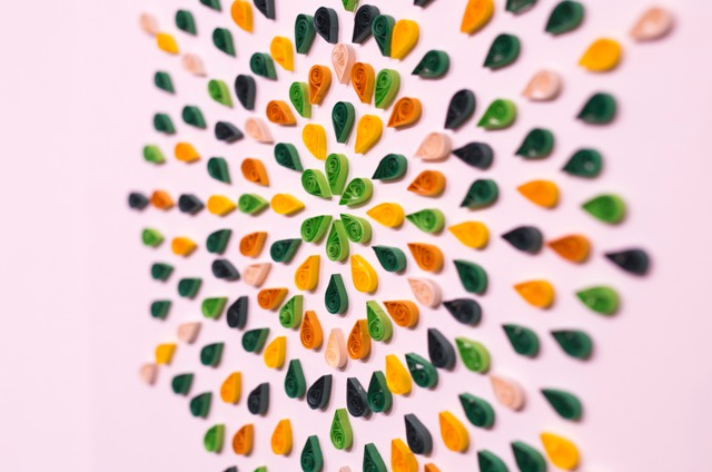
Organic Patterns
Organic Patterns was my first collaboration piece with fellow graphic designer Luke Huesseini. Luke has an careful eye for amazing art deco patterns and often works with creating repetitive complex illustrated patterns as well as hand drawn illustrations with multiple mediums of watercolour and digital design. Being so fascinated by Luke’s approach to pattern, we spoke and agreed to create a series together. This collaboration is easily one of my favourites, the organic lines are soft and carefully intertwine to create small paths. The complimentary colours which are back to back create another interesting dimension to the work. The crossing of paths creates unlikely sharp odd shadows and the complimentary colours back to back mean that the art work almost changes its form from different directions it is viewed. The thing I love the most about this is the fact that each colour combination can change the way the piece looks aesthetically and evoke different moods and feelings.
Wall of Roses
Wall of Roses:
Roses was my first ever installation which comprised of hundreds of hand made punched roses all assembled on a wall. I was inspired to create pieces made up colour to not only challenge myself to create beautiful combinations but to break through from minimalist sterile trends of black and white. The roses are created from a silhouette punch which are then layered, cut and sculpted. Roses have a very important significance in art and I was inspired by the following quote:
‘Only in art will the lion lie down with the lamb, and the rose grow without the thorn.’ – Martin Amis
The romanticist period was about beautiful works being made, often emotive and fantasy like as an escape from the everyday life. As a graphic designer, I’m used to making works that often solve problems socially however this piece was more then that. This was about creating a beautiful experience that an viewer has to walk up to in order to fully incapsulate. It is about the experience of awe when you realise the installation is 3.6 x 1.4 metres high. It is essentially the finishing piece to all the artworks.
Daisy Sphere
The Daisy Sphere was created with hundred’s of fringed strips of paper then rolled into small daisies before being glued on a polystyrene dome. The daisies are reminiscent of Pom Pom’s, which are then held together in a small flower bed. The flower bed is made up of more green flowers. This design to me was more a fun experiment then anything, at first I thought it would be too impractical however this surprisingly brought so much joy to a variety of guests.
After the launch had ended on the way home from the gallery, I was sitting with my boyfriend who asked if I was disappointed it was all over now. I have to admit, the lead up and work of 9 months up until this day was at times an overwhelming feeling. However, to have reached the day has been exhilarating. As I explained to him, I was not disappointed at all, in fact it is just a beginning to more creative work, experiences and jobs ahead.
Credits:
Luke Huesseini – Collaborating designer for ‘Organic Patterns’
Nedeljko Jovovic – Photographer
Jean Phillipe Smith – Event Photographer
Ned Considine – Copywriter
Elle Vallier- No Vacancy Gallery
Inspired Design – Print/Invitations